CLIENT
Lavanila
IMPACT METRICS
360%
increase in orders
63%
increase LFV per user
3%
increase in average order value
269%
increase in sales
140%
increase in conversion rate
19%
increase in reaching checkout
MY ROLE
Senior UI UX Designer
TEAM
Project Manager
Creative Strategist
Digital Marketer
Junior Designers
TOOLS
Figma, Miro
Shopify
TIMELINE
4-6 Months
ROLE
Senior UI UX Designer
As the lead UI/UX designer, I led the project from research and wireframes to interactive prototypes and final design. I worked alongside my team to redesign our clients existing e-commerce website using best practices.
Our goal was to enhance the user experience, improve product discovery, boost retention, and increase conversion rates. Through focused user research and iterative design, we refined the customer journey, making product exploration seamless and intuitive.
SECTION
Research + Discovery
Our research process involved close collaboration with stakeholders to deeply understand their industry pain points and customer feedback. We carefully analyzed customer reviews, social comments, and site analytics, and leveraged Hotjar recordings to gain real-time insights into user behavior and pain points.
Additionally, we performed a detailed competitive audit, pinpointing critical opportunities to match and surpass competitor offerings—ensuring the redesigned experience captured greater market share and aligned with evolving user expectations.
SECTION
Synthesizing Findings
Analyzing the research from our discovery phase, we realized that there was a huge opportunity to streamline multiple aspects of the website - including the home page, primary navigation, category pages, and product pages.
Our goal was to enhance the user experience, improve product discovery, boost retention, and increase conversion rates. Through focused user research and iterative design, we refined the customer journey, making product exploration seamless and intuitive.

before and after landing page
SECTION
Primary Navigation
By streamlining the main navigation - we were able to have our client's customers reach their desired page in two clicks instead of five.
The previous navigation was confusing because their main navigation was twice-embedded within the mega menu, as seen above.
Implementing a best practice, we removed the mega menu and the users were directed to a newly built category page.

hi-fi flow / prototype
SECTION
Category Page
On the category page, we added features such as product filtering to help users find their favorite product while also being introduced to new ones.
A user could now search by product type, size, and scent, with scent being one of the white space categories that could help separate clients from their competitors.
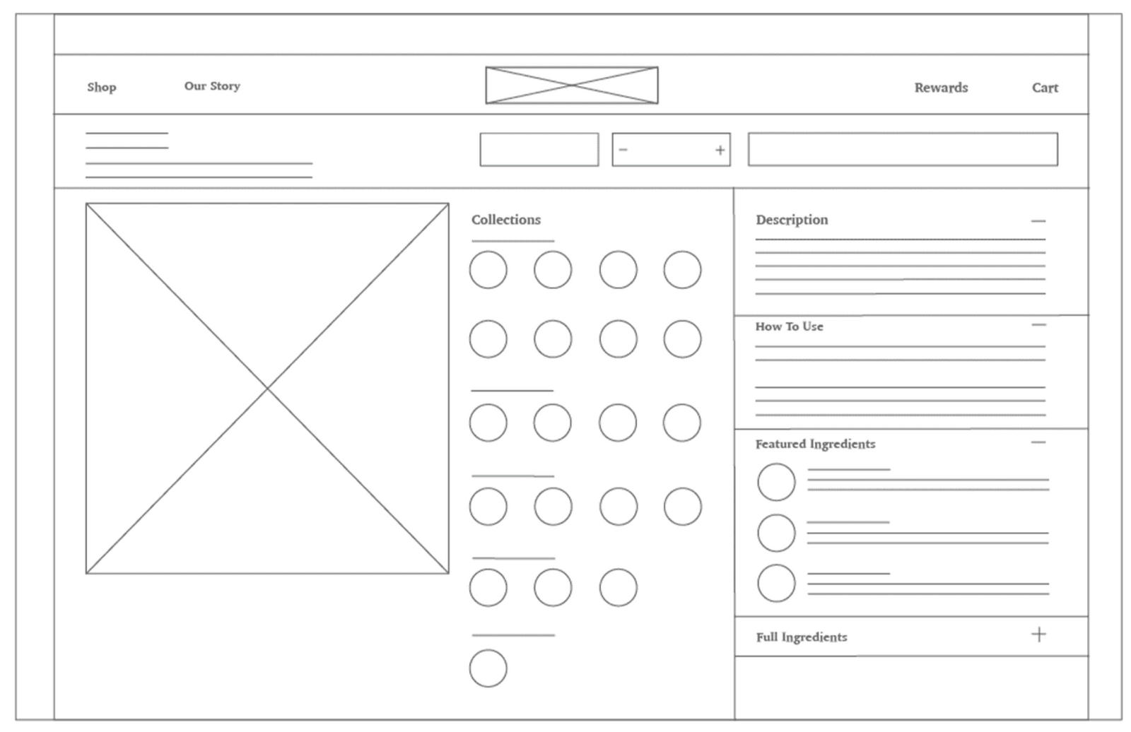
lo-fi wireframe

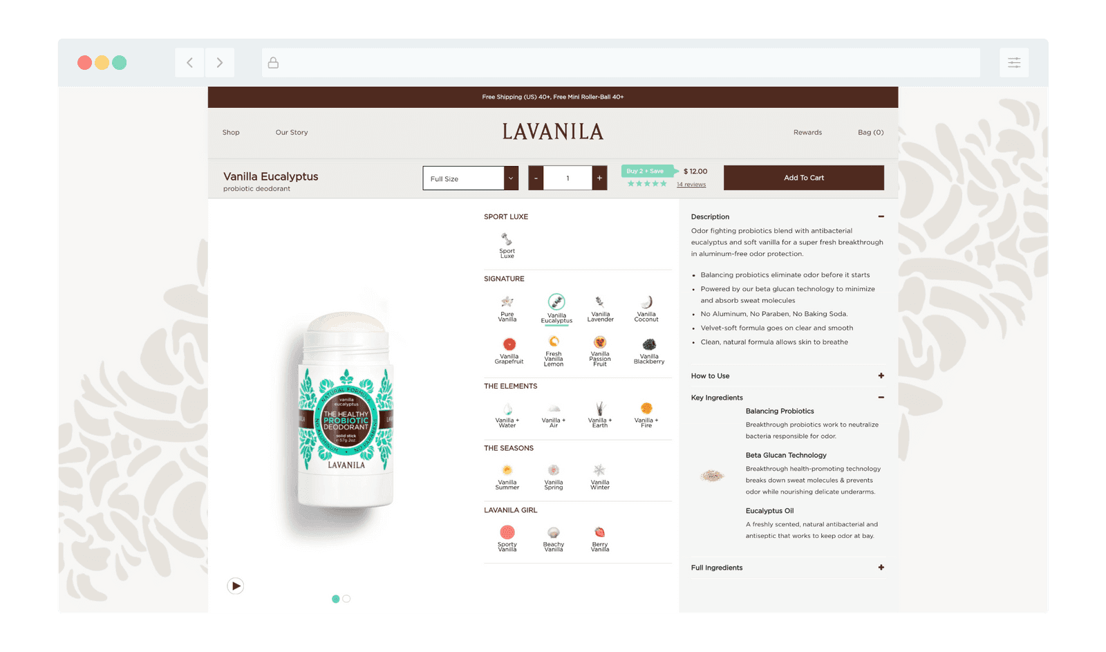
before and after product page
SECTION
Product Page
The product page had various issues, including that it was difficult for a user to self select a product.
The product type image was a circle with a solid color as seen in the screenshot to the left; The user had to select each color to differentiate the products as there was no indication what the color meant.
Now users could directly co-relate the product with the ingredient visual.
We solved this by streamlining the users ability to self select + explore products by adding an ingredient visual and product name.
Condensing product information such as product description, how to use and ingredients into one module
Adding an icon-based free-from module, which touted what ingredients their natural formulas were free-from
Creating a FAQ Module with the most asked questions by product
Added a Review section for user confidence and social-proof
SECTION
Mobile
We also designed for a mobile-first approach, making sure to also address pain-points users had on the desktop version.
The new product page on mobile also gave users quick access to all of the products on one product page by using an ingredient visual.
The add to cart module was stickied to the bottom of the browser, allowing the user to select the product size, quantity and add it to their cart without scrolling.
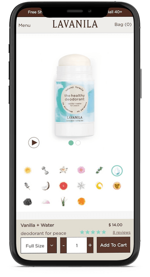
mobile product page
SECTION
Post-Launch Analytics
We also designed for a mobile-first approach, making sure to also address pain-points users had on the desktop version.
The new product page on mobile also gave users quick access to all of the products on one product page by using an ingredient visual.
The add to cart module was stickied to the bottom of the browser, allowing the user to select the product size, quantity and add it to their cart without scrolling.

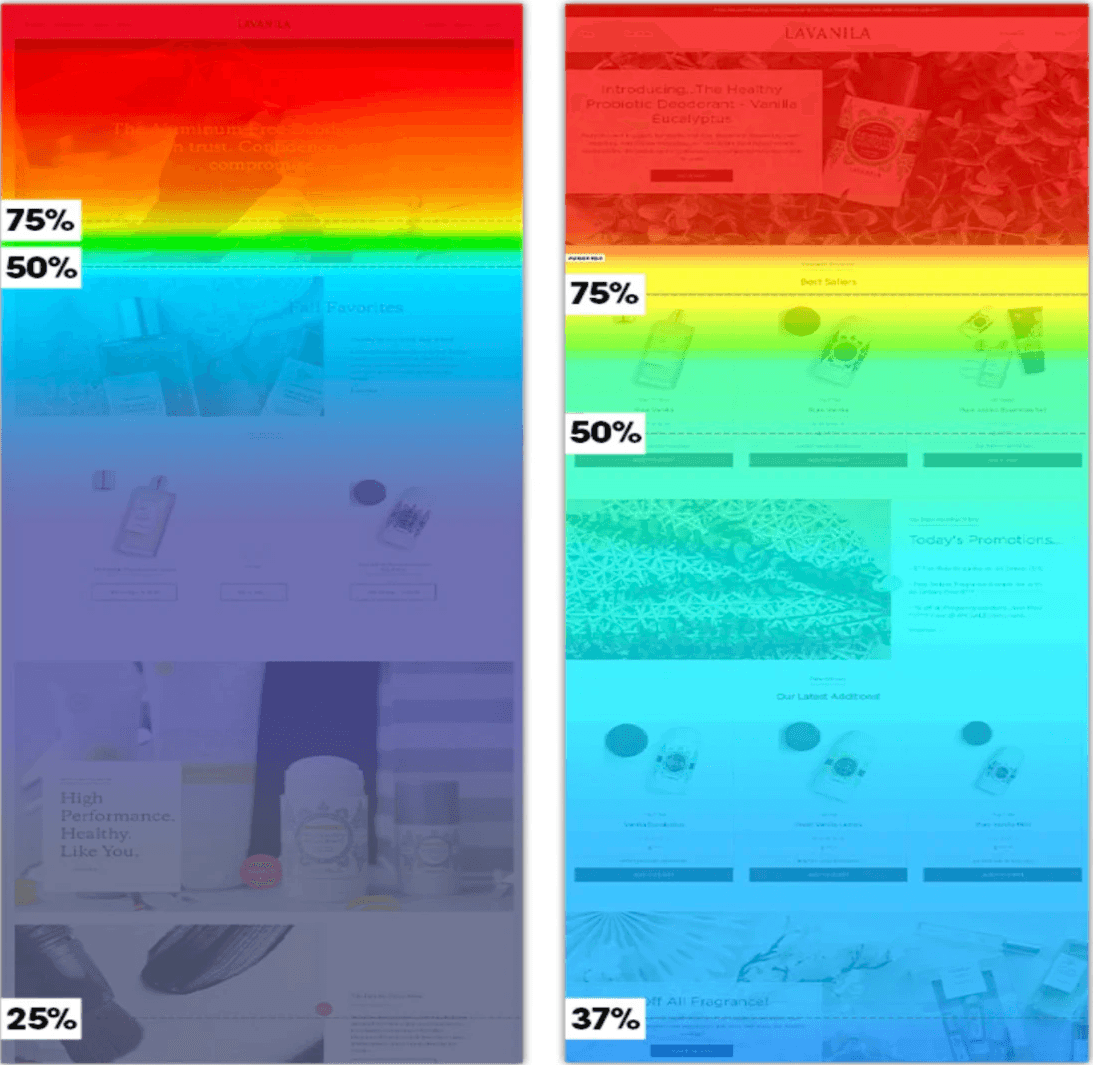
click heat map(left) and scroll heat map (right)
SECTION
Post-Launch Analytics
Click, heat, and scroll maps validated that our design updates significantly improved user engagement, directly aligning with user expectations and key business goals.
Click heat mapping demonstrated that users quickly grasped the new product selection flow and interacted more deeply with educational content.
Scroll heat maps further highlighted increased user engagement, indicating significantly higher scrolling activity compared to the previous design. This enhanced exploration directly correlated to faster content discovery and accelerated pathways to checkout.
SECTION
Post-Launch Analytics
We reached our client's end overall goals within two months of launching.
Integrating established design elements from packaging and marketing onto the website to solidify the brand's presence.
Creating a new flow for users to search for educational content + products helped increase checkout reach
Re-working their store navigator to help drive traffic to their retail partner's locations.